Nationwide Dataset of Activity Space
A nationwide dataset of de-identified activity spaces derived from geotagged social media data
Poorthuis, A., Chen, Q., & Zook, M. (2024). A nationwide dataset of de-identified activity spaces derived from geotagged social media data. Environment and Planning B: Urban Analytics and City Science, 23998083241264051.
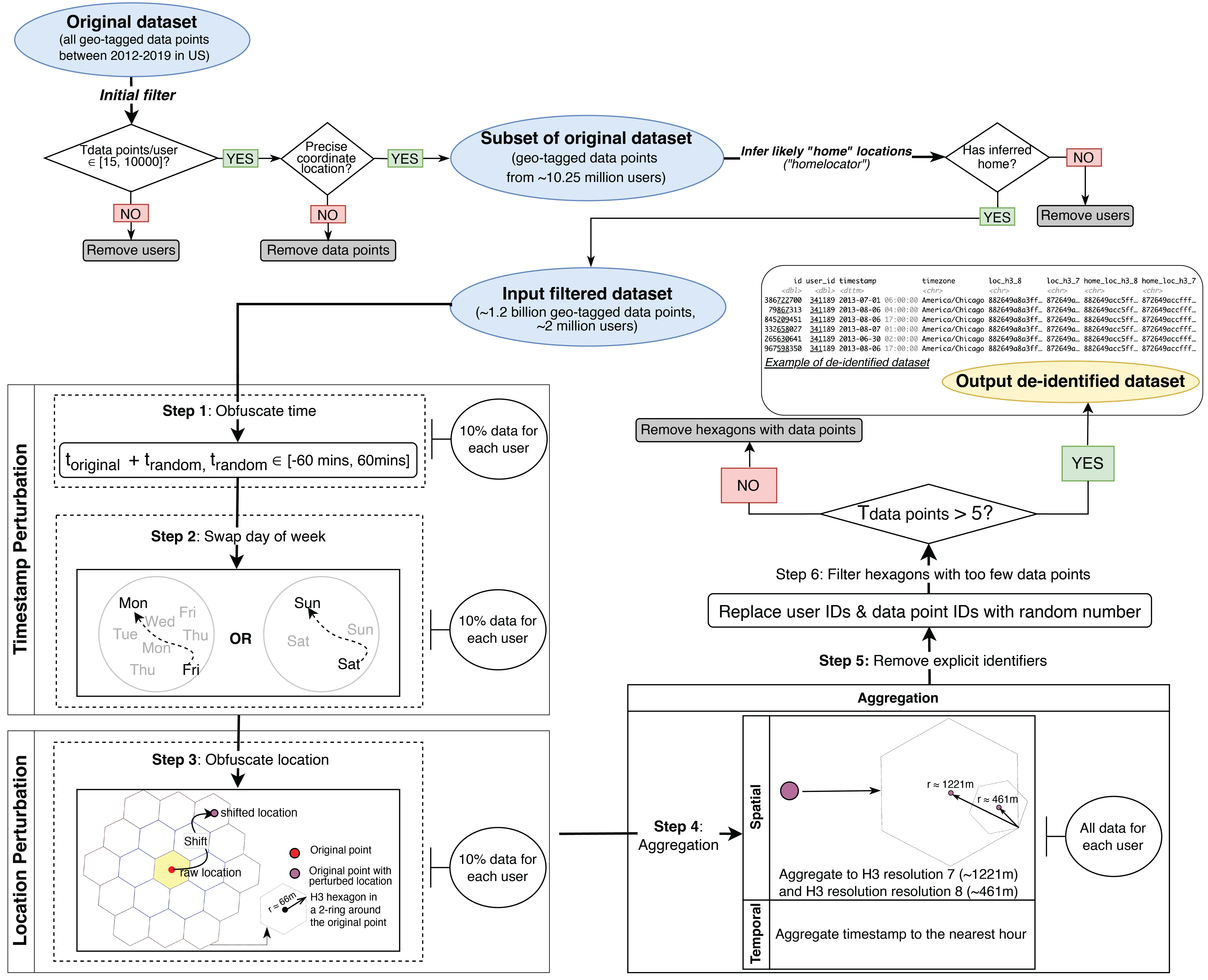
In this article, we present a historical dataset of activity spaces, originally based on publicly posted and geotagged social media sent within the United States from 2012 to 2019. The dataset, which contains approximately 2 million users and 1.2 billion data points, is de-identified and spatially aggregated to enable ethical and broad sharing across the research community. By publishing the dataset, we hope to help researchers to quickly access and filter data to study people’s activity spaces across a range of places. In this article, we first describe the construction and characteristics of this dataset and then highlight certain limitations of the data through an illustrative analysis of potential bias—an important consideration when using data not collected through representative sampling. Our goal is to empower researchers to create novel, insightful research projects of their own design based on this dataset.
Introduction
It has been well over 15 years since location-based services (LBS) and other geo-enabled digital platforms (e.g. Facebook, Twitter) became commonplace in both daily life and research. Jumpstarting renewed interest in computational approaches in the social sciences in general (Lazer et al., 2009) and the spatial sciences in particular (Miller, 2010; Singleton & Arribas‐Bel, 2019), researchers have analyzed both the social implications of these platforms and leveraged their datasets for spatial research. This journal alone has published dozens of articles on, or using, social media data . Although this research continues, particularly during the COVID-19 pandemic (e.g. Terroso-Saenz et al., 2022), change is on the horizon. A combination of increasing privacy and ethical concerns (Zook et al., 2017), and the increasing value of data (Sadowski, 2019), means that the open platforms of the early 2000s have been largely replaced by closed APIs and walled-off data. Facebook restricts access to external researchers (Brown, 2020), and Twitter, once one of the most accessible platforms for researchers, has radically altered its API and terms and conditions after Elon Musk purchased the company in 2022.
This results in the paradoxical situation of ever-more data that at the same time is not readily accessible to the scientific community. Instead of direct API access to specific data and platforms, we increasingly encounter disembedded ‘mobile application data’ derived from people’s interactions with an opaque plethora of mobile apps. This data is generated by individual people through the digital apps they use, sold to a web of data brokers who, after aggregating and combining data from many sources, sell access to the combined data. In short, the shape of, and access to, digital data in geographic research is changing precisely as research increasingly shows the potential of this data to help understand human mobility and social processes more broadly (e.g. Ballantyne et al., 2022; Xu, 2021) . Were such data to be more widely available in open and ethical ways, more insightful research on mobility and people’s activity spaces could be conducted (Poom et al., 2020).
With this in mind, we devise a method for more widely sharing historical social media data that we have collectively created over the last decades to offer an open, standardized data source for geographic research. While a myriad of research designs might leverage social media data, we focus our effort on the concept of activity spaces specifically. Activity spaces, encompassing all the activities and locations that an individual might visit during their daily life, are a cornerstone of geographic thought tracing back to Hägerstrand’s time geography (Hägerstrand, 1970). New data sources, including the social media data described here, have enabled an increasing integration of this concept in a wide range of geographic work (Müürisepp et al., 2022). Data on activity spaces can help illuminate broader urban processes, ranging from gentrification and neighborhood change (Poorthuis et al., 2021) to segregation and access to green space (Heikinheimo et al., 2020; Väisänen et al., 2022). However, access to open data is increasingly challenging potentially leading to a fragmented landscape where studies are difficult to compare, replicate or even just start if researchers are unable to gain access to the requisite source data.
In this article, we present a historical dataset of activity spaces, originally based on publicly posted and geotagged Twitter posts across the United States from 2012 to 2019. The dataset, which contains approximately 2 million users and 1.2 billion data points, is de-identified and spatially aggregated to enable ethical and broad sharing across the research community. By publishing the dataset, we hope to help researchers to quickly access and filter data to study people’s activity spaces across a range of places, from downtown Chicago and rural Montana; or conversely to support the analysis of the origin of visitors to the nation’s national parks or one specific neighborhood in Austin, Texas. In this article, we first describe the construction and characteristics of this dataset and then highlight certain limitations of the data through an illustrative analysis of potential bias – a perennial concern when using data not collected through representative sampling (Longley et al., 2015; McNeill et al., 2017). From this basis, researchers can be empowered to create novel, insightful research projects of their own design.
Bias
Social media data has often been used to study mobility and mobility-related processes. However, the inherent bias within this data, and differences with representative sampling, are frequently raised as issues hindering further adoption (e.g. Longley et al., 2015; McNeill et al.,2017). Comprehensive analysis evaluating this bias at a fine spatial resolution remains largely unexplored and is often limited to noting that Twitter users are younger and richer than the average American (Pew Research Center, 2019). Significantly this understanding of user characteristics come from nationwide surveys by PEW Research and do not offer any insights into the potential variation of this bias across different parts of the country. To address this gap, we examine the potential bias within this dataset by comparing the density of home locations to population data from the US Census.
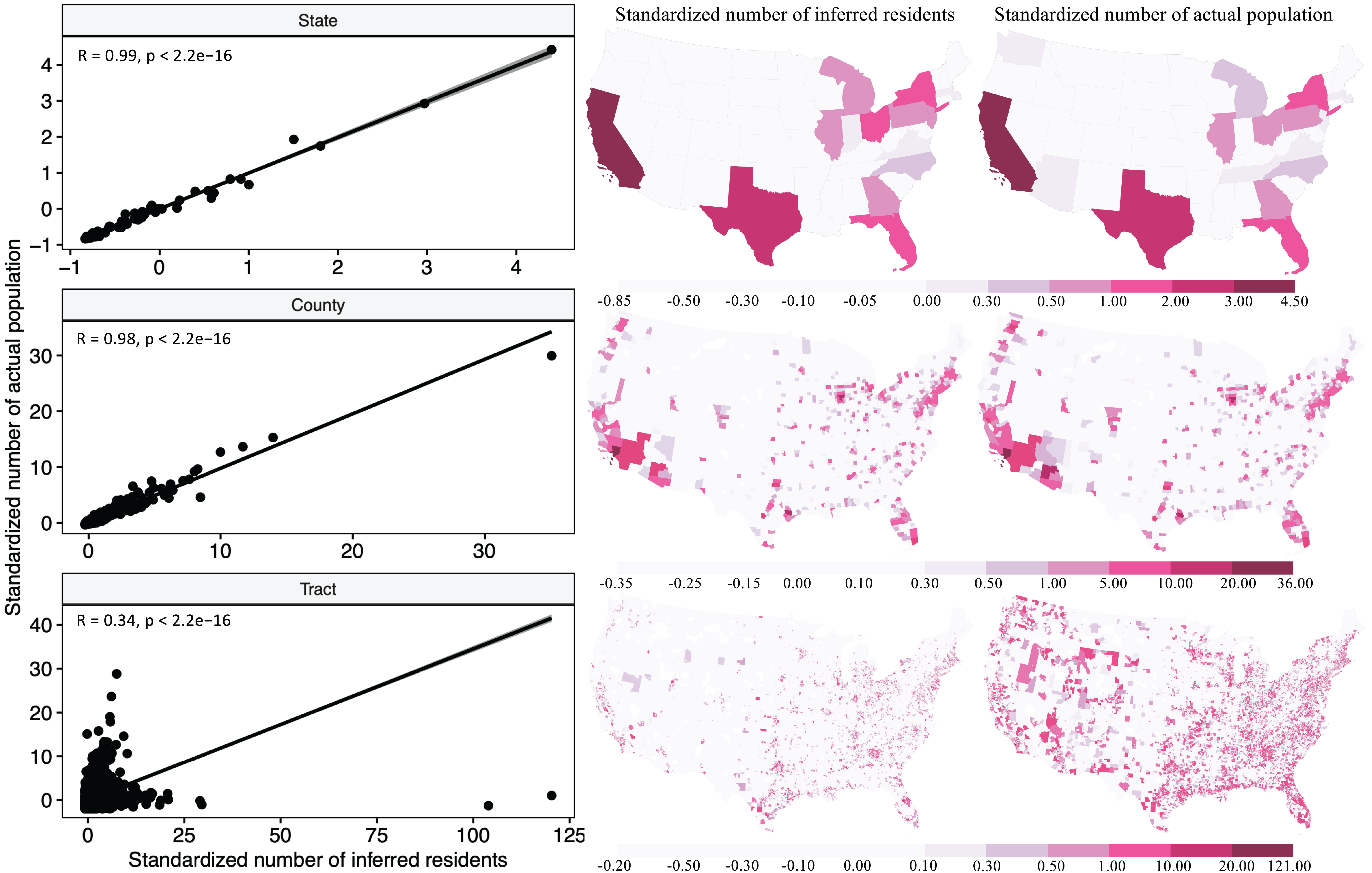
Figure 2 compares the standardized census population against the user population in the dataset. What is clear is that the reliability of the data is spatially dependent. The correspondence at the state and county level is very strong (Pearson’s r = 0.99 and 0.98 respectively), but the correlation at the census tract level is much lower (Pearson’s r = 0.34), revealing considerable over- or underrepresentation in specific census tracts.
To better illustrate the spatial variation in this misrepresentation of users, we conduct a geographically-weighted regression (GWR) with the number of user home locations as the dependent variable and the following independent variables: census population; median household income; median age; and percentage of white people. Since the number of users represents count data, we use a generalized linear model (GLM) to estimate a Poisson regression. Figures 3 and 4 show the estimates for each of the independent variables at the county and tract level respectively.
At the county level, a few things stand out. First, the median age in the global model has a negative effect on the number of users, corresponding to the general relationship found in the PEW Research data. However, this effect is significantly diminished in the GWR local coefficients in parts of the West Coast and much stronger than the national average in a north- south corridor in the middle of the country. Even more extreme, the effect of the percentage of white people in this middle corridor is positive overall, as it is in areas such as the Pacific Northwest (i.e., a higher percentage of white people generally means a higher number of users within the dataset). The direction of this effect, however, flips completely in several states including California, Colorado and the Gulf Coast region.
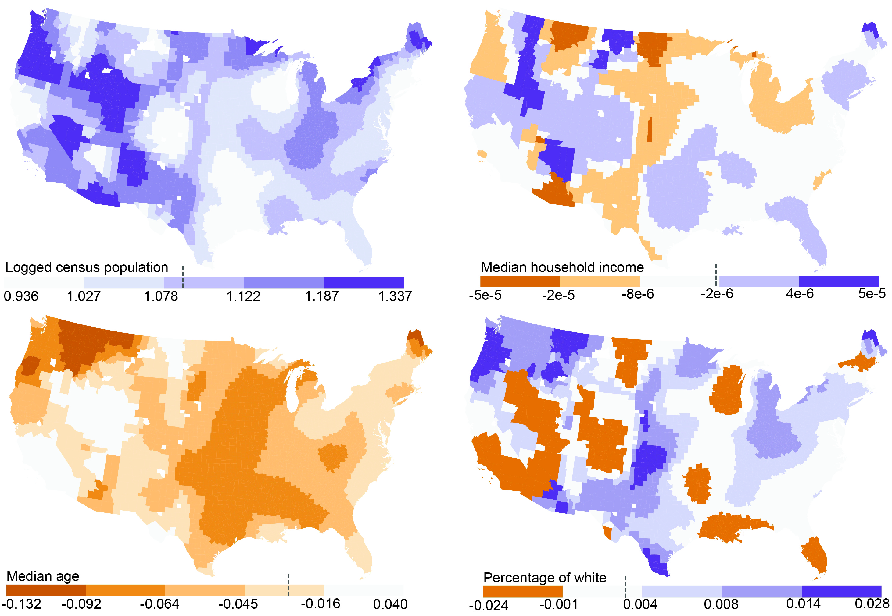
Figure 3: The spatial distribution of coefficients for different independent variables at county level. (a) census population; (b) median household income; (c) median age; (d) percentage of white(The vertical dashed line on the legend indicates the coefficients from the global model).
Shifting to the tract level highlights further localized differences (see Fig. 4). For example, the effect for percentage white is consistently positive in Manhattan, including in Harlem, suggesting a relative underrepresentation of non-white people in these areas. In contrast, Los Angeles has areas with both positive and negative effects, with the African-American neighborhood around Compton showing a negative effect. In short, the relationship between race and the density of users in the dataset might very well vary between these two major cities.
Given this variegated (bias in) density of users within the dataset, general and generalizing use of this data should be done cautiously. Nonetheless, the broad scope of this dataset also opens the door for specific approaches that address bias. Depending on the research question and design, users from different neighborhoods could be weighted differently so that the final dataset more closely resembles the population of interest. Alternatively, if the social or spatial group of interest is relatively small (or does not have a large presence in the dataset), these neighborhoods can be oversampled deliberately (and others undersampled). Alternatively, researchers might decide to focus only on users from a specific neighborhood(s) of interest.
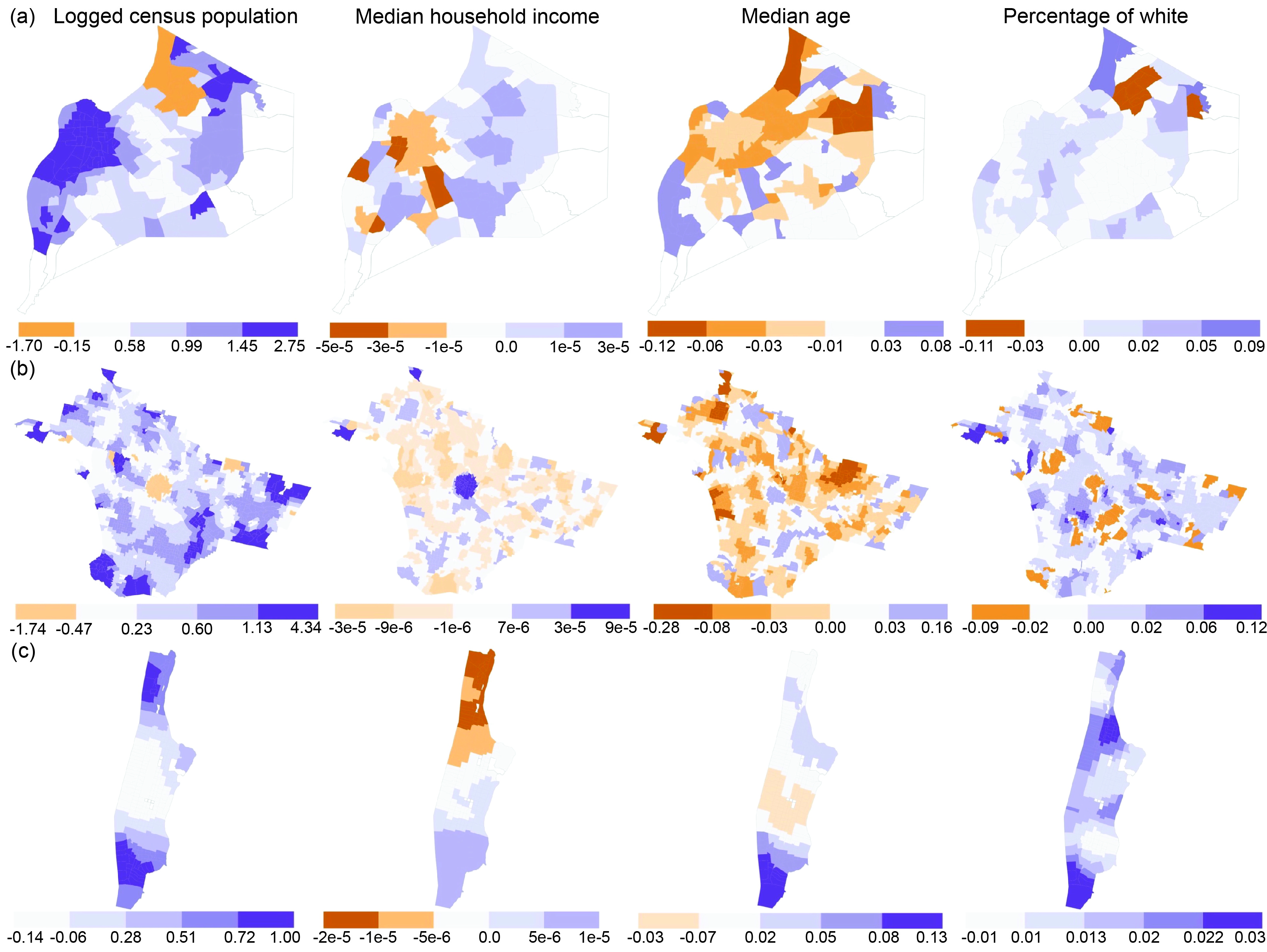
Figure 4: The spatial distribution of coefficients by different independent variables at tract level.(a) Jefferson, KY; (b) Los Angeles, CA; (c) New York, NY
We hope that the current dataset might help leverage the last two decades of human activity on social media platforms and perhaps enable a larger group of researchers to incorporate human mobility data in their analyses. To give a concrete example of a starting point for such analysis, we include an example of mobility flows derived from activity spaces in a single US county (Jefferson County, KY) in Figure 5 and a subsequent illustration how these activity spaces could be used in Figure 6. This, of course, needs to be done in a critical and cautious manner as this data is not created by a representative sample of the population. Nonetheless, the scale of the data allows for a concerted effort in this manner so that potential bias can be considered at the research design phase.
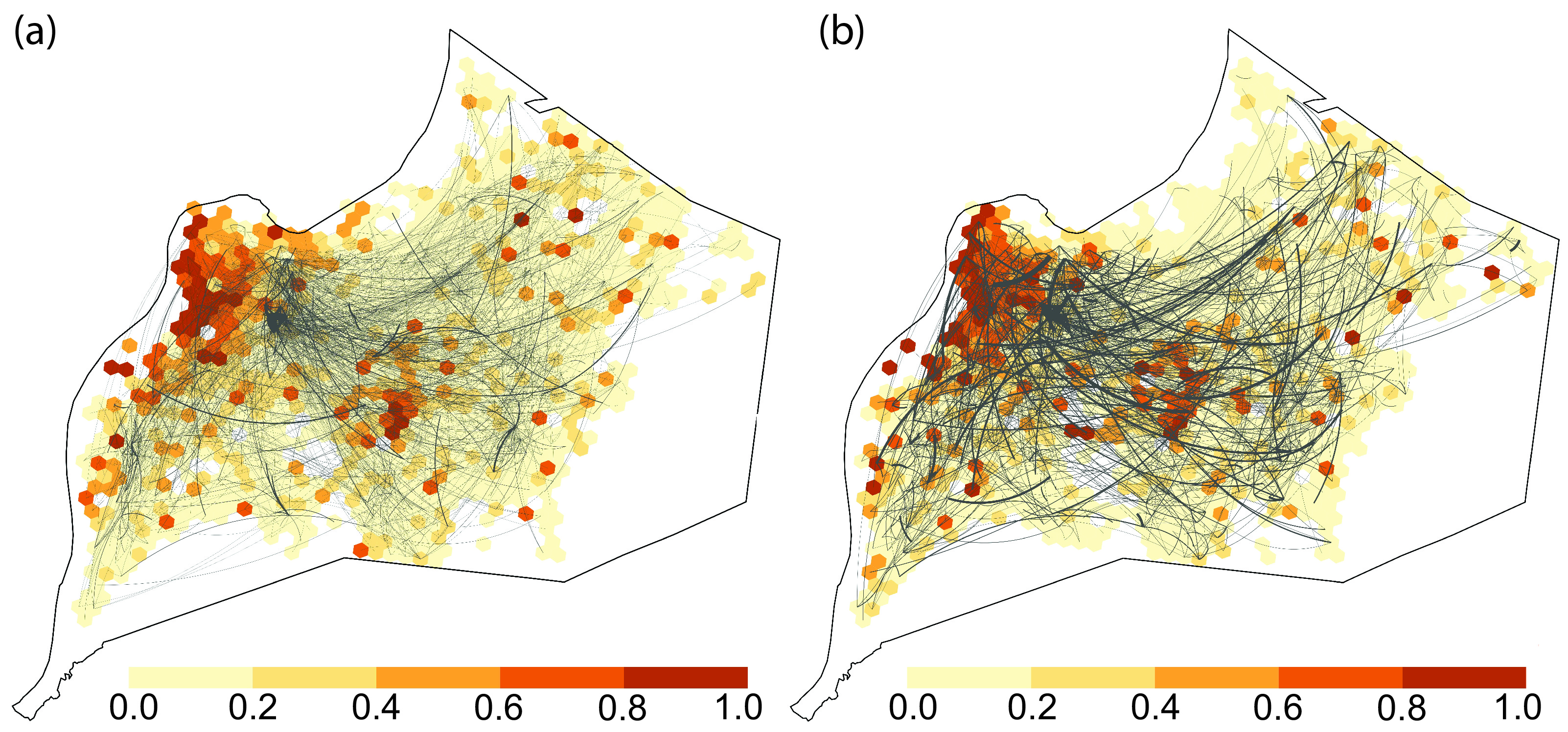
Figure 5: An example of using the activity spaces of African Americans in Jefferson County, KY for specific time periods (a) Wednesday between 8AM-6PM (b) Sunday after 7PM.
The lines indicate the connections between home locations and visited places. The choropleth map indicates the percentage of African-Americans relative to all visitors in each location. The vignette in the documentation of the dataset has more details on how the data for one specific county was extracted from the data and how activity spaces were linked to data from the Census.

Figure 6: The spatial distribution of African Americans in Jefferson County, KY according to different(residential versus activity space perspectives). The top-left includes two specific segregation metrics: the dissimilarity index (Duncan & Duncan, 1955) and the exposure index (Wong & Shaw, 2010). Note how the residential segregation patterns between the Census and the de-identified social media data set are very similar but how the activity space perspective shows increased segregation on Sunday evenings when compared to a regular weekday. (a) Percentage of African American derived from Census data (b) Percentage of African American inferred from de- identified geotagged data (c) Percentage of African American at visiting places on Wednesday between 8AM-6PM (d) Percentage of African American at visiting places on Sunday after 7PM.