Entangled footprints
Understanding urban neighbourhoods by measuring distance, diversity, and direction of flows in Singapore
Chen, Q., Chuang, I. T., & Poorthuis, A. (2021). Entangled footprints: Understanding urban neighbourhoods by measuring distance, diversity, and direction of flows in Singapore. Computers, Environment and Urban Systems, 90, 101708.
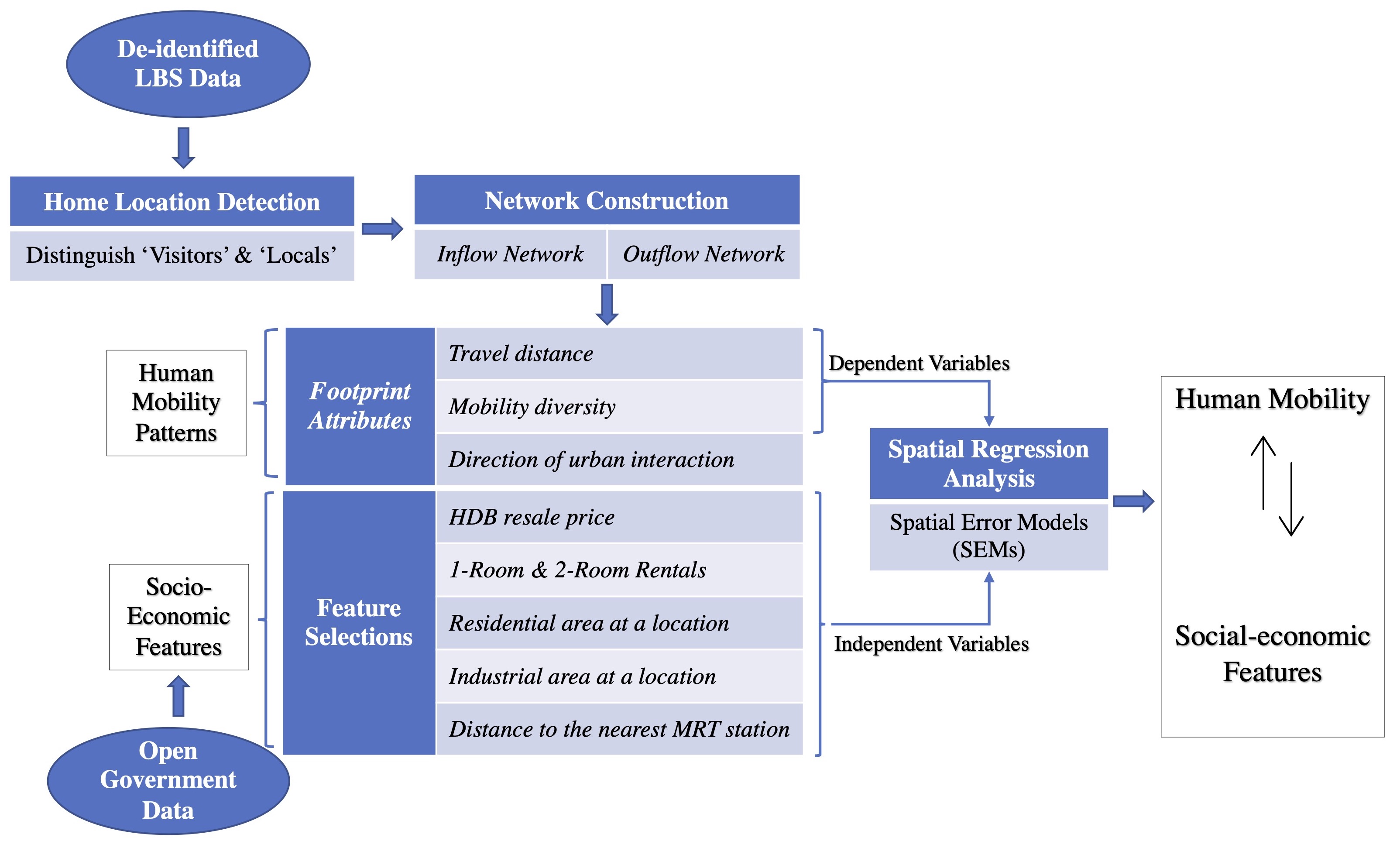
Traditional approaches to human mobility analysis in Geography often rely on census or survey data that is resource-intensive to collect and often has a limited spatio-temporal scope. The advent of new technologies (e.g. geosocial media platforms) provides opportunities to overcome these limitations and, if properly leveraged, can yield more granular insights about human mobility. In this project, we use an anonymized Twitter dataset collected in Singapore from 2012 to 2016 to investigate this potential to help understand the footprints of urban neighbourhoods from both a spatial and a relational perspective. We construct home-to-destination networks of individual users based on their inferred home locations. In aggregated form, these networks allow us to analyze three specific mobility indicators at the neighbourhood level, namely the **distance, diversity, and direction** of urban interactions. By mapping these three indicators of the spatial footprint of each neighbourhood, we can capture the nuances in the position of individual neighbourhoods within the larger urban network. An exploratory spatial regression reveals that socio-economic characteristics (e.g. share of rental housing) and the built environment (i.e. land use) only partially explain these three indicators and a residual analysis points to the need to explicitly include each neighbourhood's position within the transportation network in future work. Figure 1 displayes an overview of research outline.
Introduction
Human mobility has been a long-standing interest in Geography. This interest has intensified in the last two decades with the advent of new technologies (e.g. GPS, geosocial media) allowing increasingly finely-grained analyses of mobility patterns, with applications ranging from urban planning to epidemiology (Kraemer et al., 2020; Shi, Wang, Xu, & Wang, 2020; Zhang, Chen, Ma, Li, & Tang, 2020). Of particular interest to urban researchers has been the relationship between human mobility and the underlying urban structure that can be revealed by mobility patterns (Liu, Murayama, & Ichinose, 2020; Saxon, 2020; Sun, Fan, Li, & Zipf, 2016; Zhong et al., 2017). The perennial discussion about the degree of centrality or polycentricity that urban systems exhibit is a clear example of this interest.
We take this promising intersection of urban structure and human mobility analysis as a starting point to further unpack the constituent parts of the urban system. Concretely, instead of taking a city as the unit of analysis and determining the degree of its centricity, our analysis focuses on a finer-grained spatial scale: individual neighbourhoods. To operationalize these neighbourhoods, we tessellate geographical space in a regular grid of hexagonal cells that we refer to as ‘neighbourhoods’ in the remainder of the paper. This allows us to address questions regarding specific neighbourhoods and their role within the system. In other words, we are trying to understand where and how people move within and between neighbourhoods. Which specific neighbourhoods operate as functional centres? Are particular neighbourhoods dependent on other ‘central’ locations, or are they principally self-contained?
These questions – and others alike – have direct urban policy implications, perhaps best exemplified in the recent uptake of ‘20-minutemin’ planning goals pursued by cities all over the world (e.g. Capasso Da Silva, King, & Lemar, 2020; Moreno, Allam, Chabaud, Gall, & Pratlong, 2021; Weng et al., 2019). We argue that a human mobility lens on urban neighbourhoods can generate valuable insights for these planning questions, especially when combined with the analytical latitude offered by new types of mobility data that provide more flexible definitions of the size and shape of neighbourhoods.
To illustrate this potential, we put the proposed method to the test in an applied case study focused on Singapore. Singapore has a specific history of master planning which has explicitly focused on decreasing the reliance on the central downtown core through the formation of a polycentric structure based on satellite town centres. Previous studies have determined this masterplan to be more or less successful (and the city thus to be either more monocentric or more polycentric), depending on the analytical perspective and datasets used (Dale, 1999; Han, 2005; Zhong et al., 2017).
For our analysis, we utilize a de-identified dataset that consists of all tweets sent between 2012 and 2016 from Singapore (Chen & Poorthuis, 2021). Although we use Twitter data in our case, the methodology proposed here can be applied to data from other Location-Based Services (LBS), such as Instagram, cell phone data, Weibo, Facebook, etc. As such, we consistently refer to the used dataset as ‘LBS data’ in the remainder of the paper. Crucially for the analysis at hand, such datasets allow for the potential to draw connections between each user’s ‘home’ location and all other locations they have visited across the city.
In concrete terms, we calculate three core metrics for each neighbourhood for both incoming and outgoing flows: the distance of flows (i.e., the distance between the source and sink of a flow or interaction); the diversity of flows (i.e. for incoming flows: the diversity of sources; for outgoing flows: diversity of sinks); and the cardinal direction of flows (i.e., the average orientation of incoming or outgoing flows). We will present these three metrics through a series of visualizations and use them to reveal specific patterns in the spatial footprints of neighbourhoods in Singapore.
In doing so, we illustrate four specific methodological affordances that are created by the application of human mobility data on the structure of urban neighbourhoods. First, it gives us the flexibility of creating neighbourhood boundaries and scales tailored to the research questions at hand, allowing analyses at a very granular level. Second, it provides an innovative way to capture aspects of the diversity of a neighbourhood by considering the origin of its visitors, instead of only the characteristics of its residents or neighbourhood facilities. Third, mobility data complements understanding neighbourhoods based on a residential census or survey research with a view based on actual flows of people. Fourth and related, we can perform analyses for both inflow and outflow of people, each offering a different perspective on the same neighbourhood.
Distance of flows
Based on the home-to-destination networks, we measure both incoming and outgoing travel distances for each neighborhood. For each neighborhood, the incoming distance is estimated based on trajectories of visitors between the centroids of their home locations to the centorid of that neighborhood, and the outgoing travel distance is estimated based on the trajectories of locals between the home neighborhood centroid and the centorids of all other neighborhoods they've visited.
Figure 2 visualizes the mean and standard deviation of the travel distance in each grid cell for both inflow and outflow networks. The mean travel distance for the inflow network is about 10.3km (S.D. 6.1km). We can see that neighborhoods with a large travel distance (>10km) generally appear around the edges of the city, notably in the west, east, and southern regions. Part of this can be explaned due to Singapore's island geography, but on closer inspection neighborhoods with such a high distance tend to be fairly specific. For the outflow network, the average travel distance is around 6.6km (S.D. 2.4km), which is lower than that of the inflow network. This is because the outflow is based on people’s home location and thus captures their overall mobility footprint, while the inflow includes all types of locations (residential and non-residential) thus also covers special urban functions that are travelLed to over relatively large differences, but far less often than (nearby) daily errands. Here we observe a pattern emerging in the peripheral areas where people travel longer distance thaan those living in the central areas.
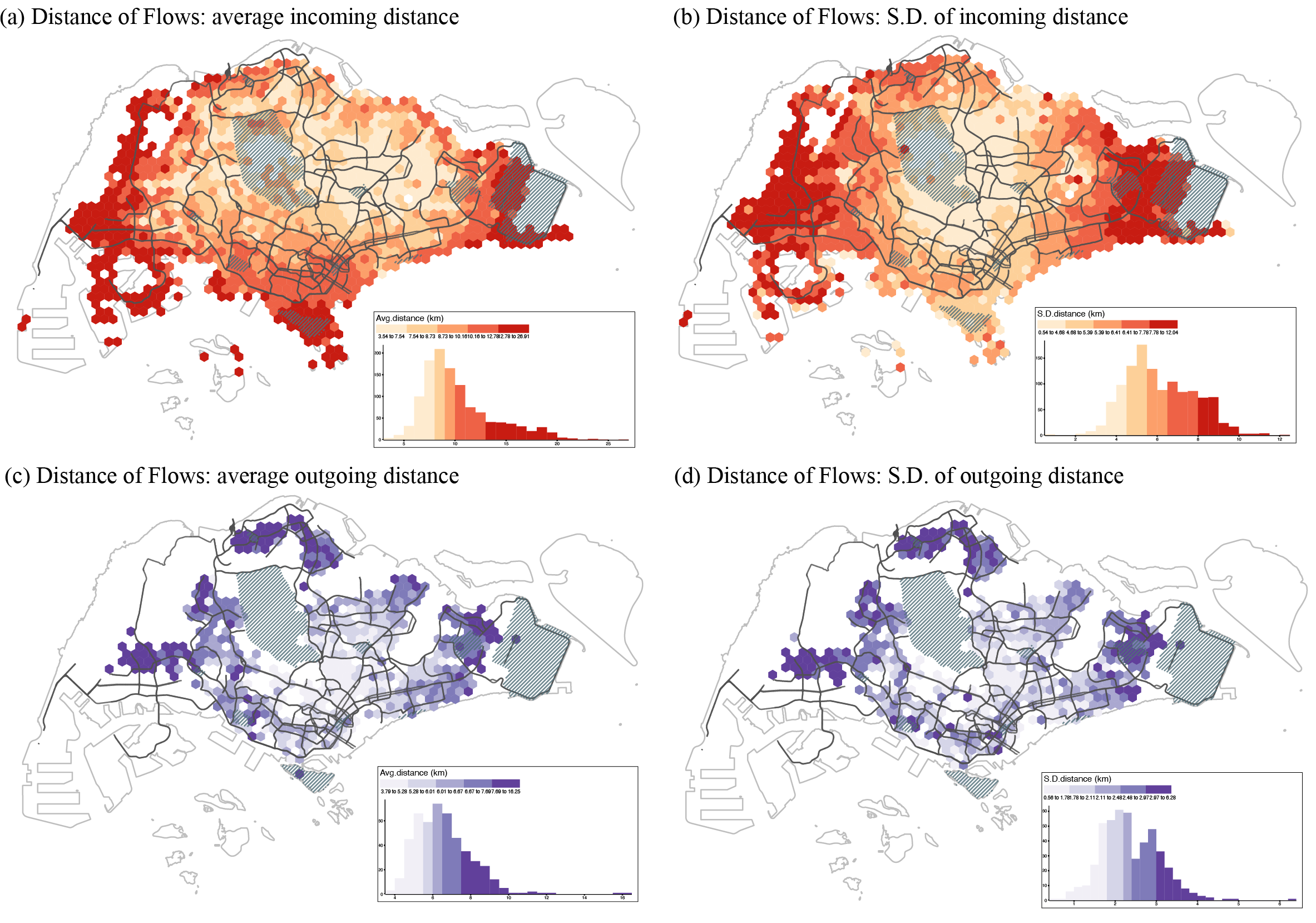
Figure 2. Distance of flows (a) Spatial distribution of average inflow distance; (b) Spatial distribution of standard deviation of inflow distance; (c) Spatial distribution of average outflow distance; (d) Spatial distribution of standard deviation of outflow distance.
Diversity of flows
To operationalize the metric of diversity, we measure the inflow and outflow diversity according to the variety and intensity of the origin neighborhoods (for inflow diversity) and destination neighborhoods (for outflow diversity). Figure 3 shows an example of how we create unique and dynamic concentric sectors for each neighborhoods for diversity measurement using Shannon;s diversity index.
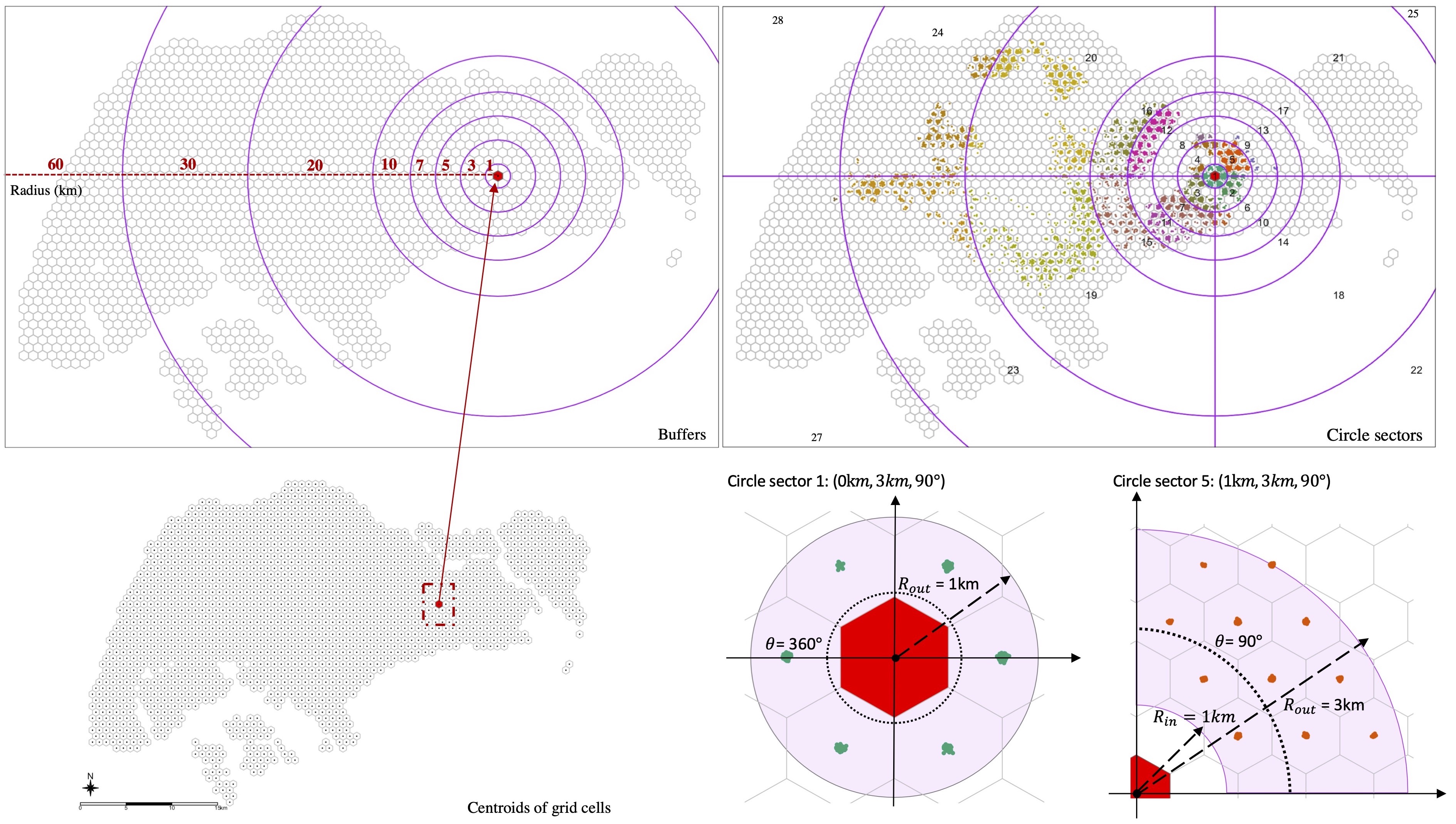
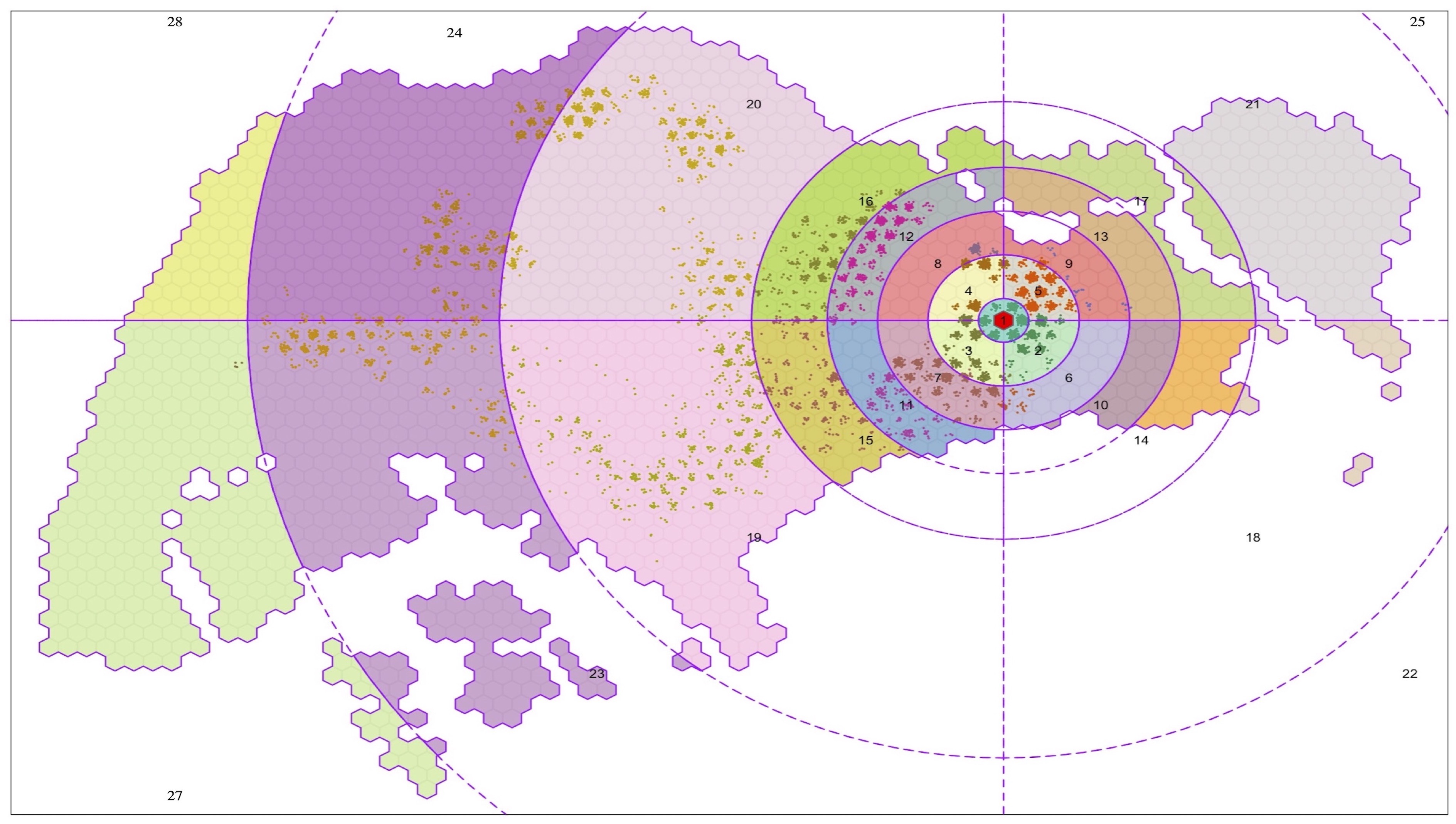
Figure 3. Left: Concentric sectors of a grid cell. (a) eight buffers around the geographical centre of a grid cell; (b) concentric sectors; (c) a selected grid cell; (d) examples of the innermost sector and a selected sector. Right: An example of spatial distribution of datapoints at different sectors for diversity measurement.
Figure 4 visualizes the diversity of flows for both the inflow and outflow networks. We observed that the city centre displays a high inflow diversity, which corresponds with its central urban function within Singapore. It also benefits from the road and public transportation networks that are built to coverge on this area. In contrast, the outflow in the area is relatively low, indicating residents living near the centre might not have to travel widely to meet their daily essentials.
Looking beyond central urban functions, we can zoom in on some regional centres in the city, as designated in the Concept Plan 1991. [Tampines](https://en.wikipedia.org/wiki/Tampines) - located in the East region of Singapore, is one such centre and is also one of the most populous residential areas in Singapore. Tampines has modest scores of inflow diversity, indicating that it generally services residents from a limited set of (likely nearby) neighbourhoods. Its outflow diversity is relatively low as well, which indicates its residents can obtain their daily needs locally, corroborated by the relatively low travel distance in Figure 5c. It is a testament to the relative success of Tampines as a regional centre, with its provision of shopping malls, hawker centres, other retail amenities, as well asa sizable number of jobs.
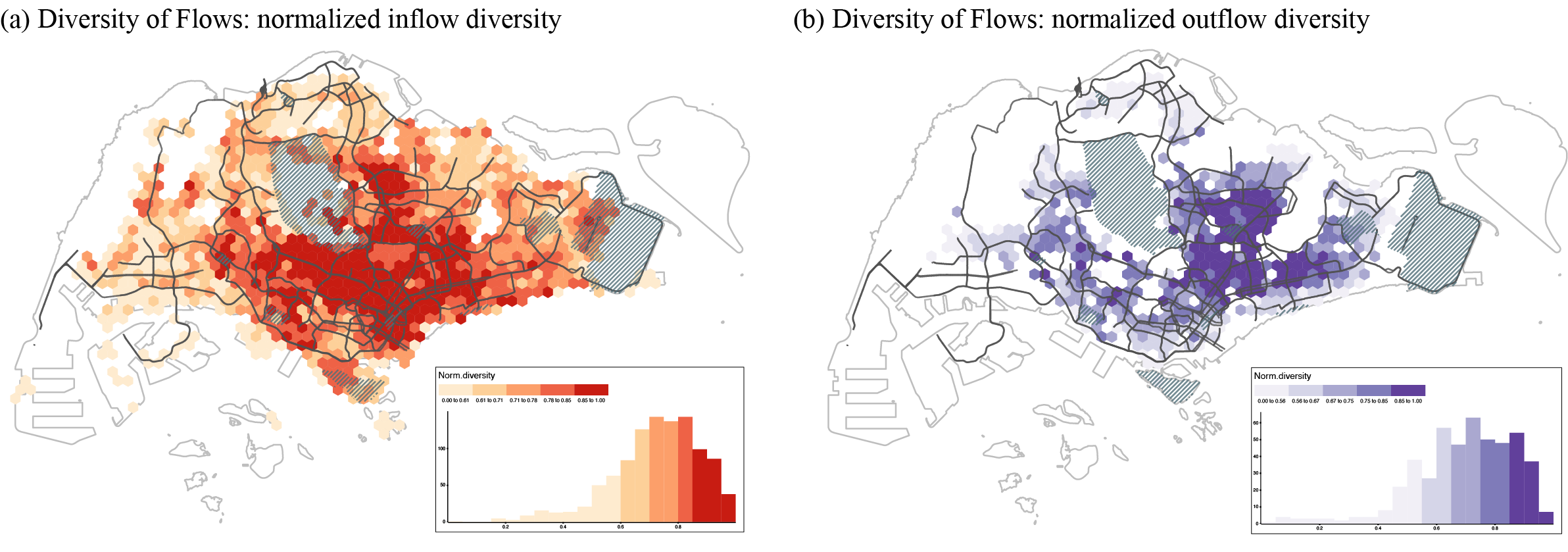
Figure 4. Diversity of flows (a) Spatial distribution of normalized inflow diversity; (b) Spatial distribution of normalized outflow diversity.
Direction of flows
Flows into or out of a neighborhood can happen in all cardinal directions and with different intensities and distance. Visualizing the entire network of these connections is not very insightful for making neighbourhood-level inferences. As such we create a single metric that summarizes the overall direction and strength of flow to or from a neighborhood.
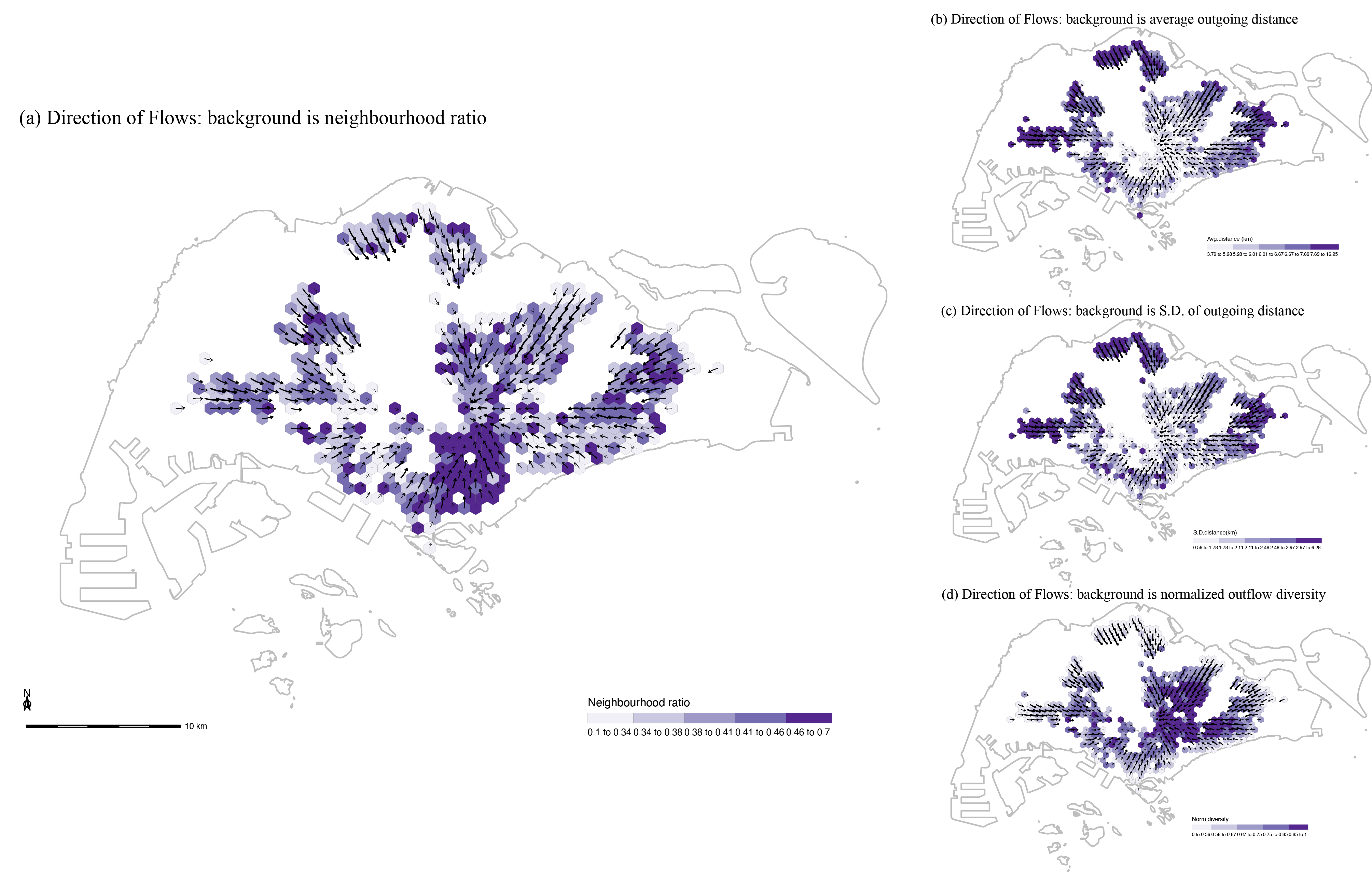
Figure 5 and 6 visualize directional summaries for each grid cell as a vector flow map. To provide a context for these flows, we display a neighborhood ratio in the underlying choropleth map. The neighbourhood ratio is measured based on the weighted number of tweets sent within 3km from the geographical centre of the visited neighbourhood for the inflow network or from the geographical centre of the home for the outflow network. To make comparison across maps easier, the mean travel distance, the standard deviation of travel distance, and the diversity of flows are also presented in sub-figures.
From the inflow netowrk shown in Figure 5, it seems that the directional orientation of neighbourhoods in Singapore does not exhibit a monocentric pattern, but a rather polycentric one where footprint flows anchor onto a series of sub-centres. It should be noted that this pattern is likely to shift when we would only focus on, for example, commuting interactions but the LBS dataset here does not differentiate between different types of interactions. In the outflow network displayed in Figure 6, we observe a starkly different spatial pattern, where the direction of outgoing interactions does focus heavily on the centre of Singapore. This does not necessarily mean that all residents, or even a majority, travel all the way to the centre, as this may solely reflect flows in the general direction of the centre to locations before or after the centre itself.
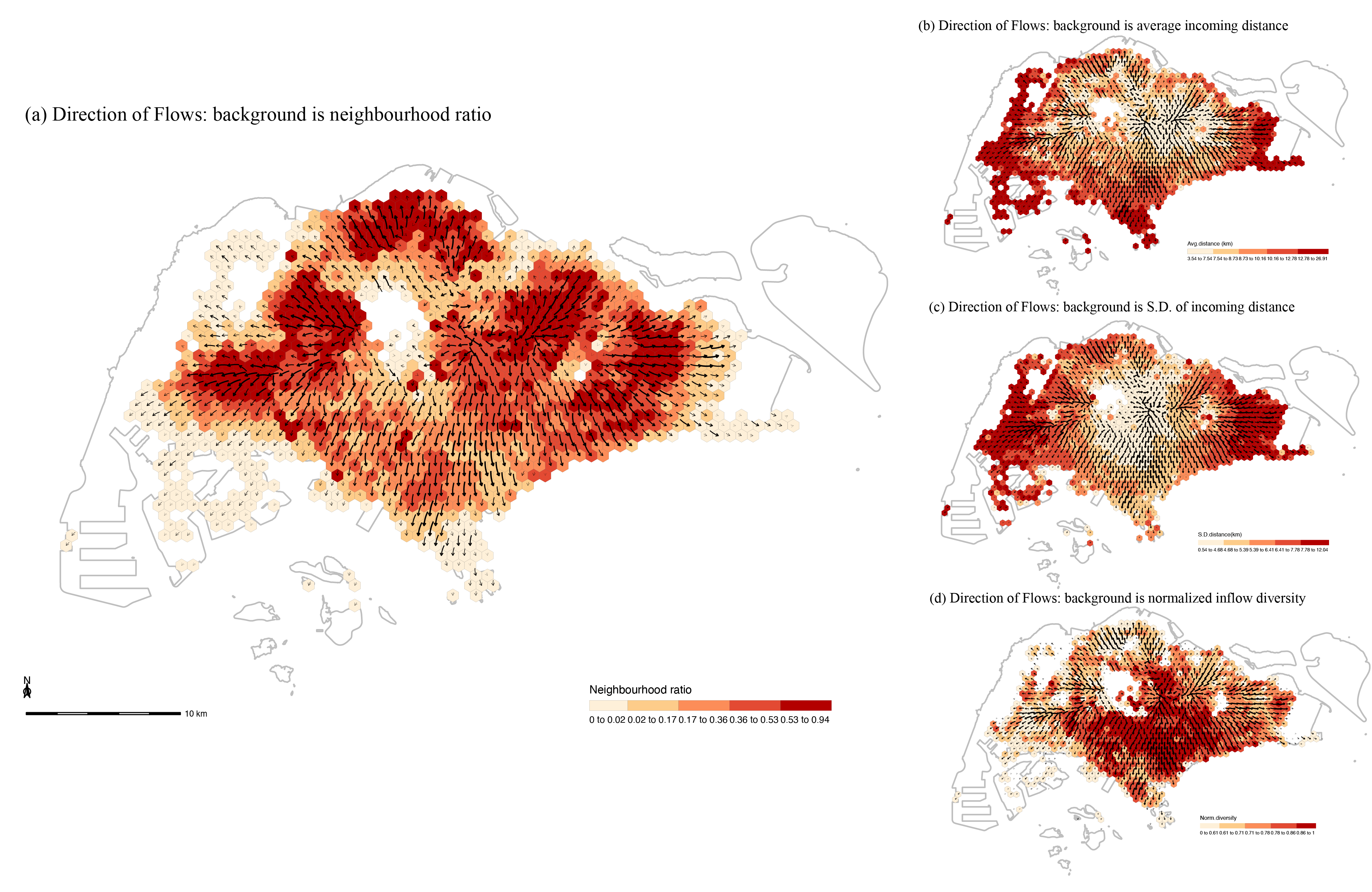
Figure 5. Flow maps with different metric backgrounds for the inflow network (a) Background with neighbourhood (within 3km) ratio; (b) Background with average incoming distance; (c) Background with standard deviation of incoming distance; (d) Background withnormalized inflow diversity.
For more details of this project, please check our paper here. Besides, all data and code needed to reproduce the results and figures in this study are available at entangledfootprints. You can also install the compendium as an R package, entangledfootprints, from GitHub with:
# install.packages("devtools")
remotes::install_github("spatialnetworkslab/entangledfootprints")